
Tin Packaging Finishes: How to Build Premium Brand Value and Shelf Appeal
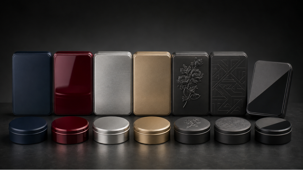
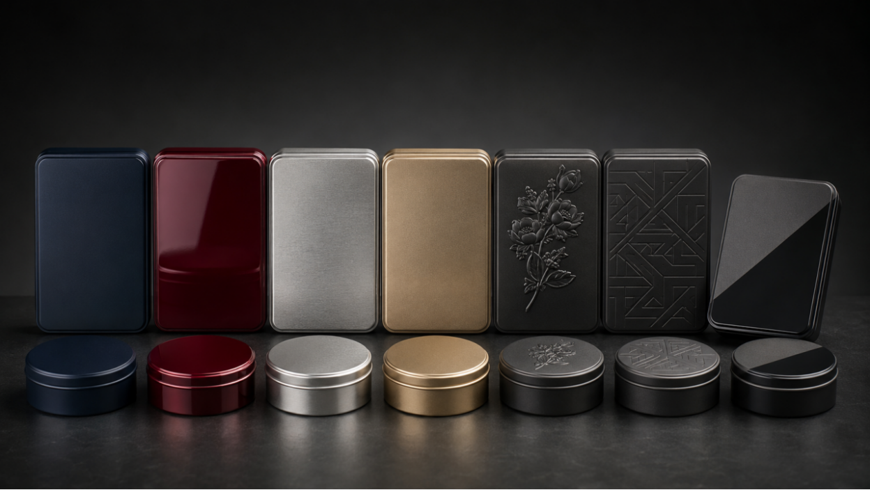
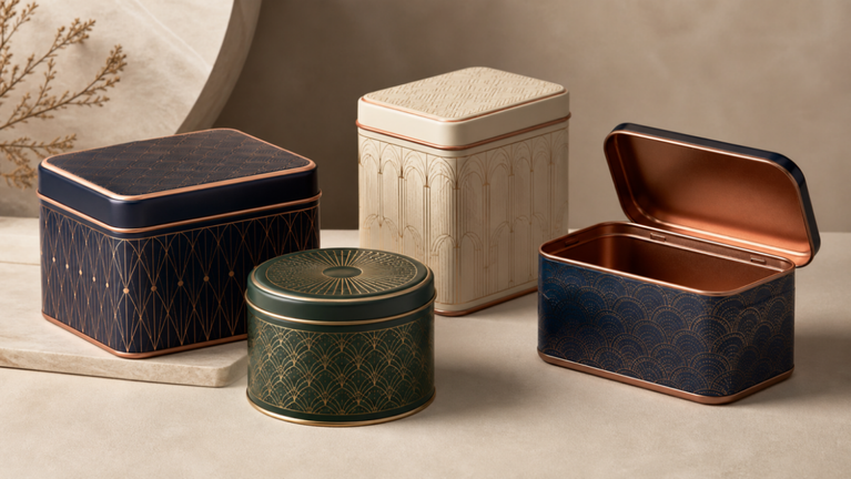
Tin packaging finishes influence how a package looks, feels, photographs, and survives handling. Matte varnish can create restraint, gloss can deepen color, metallic show-through can make the material part of the artwork, and embossing can add a tactile focal point. The best finish is not the one with the longest process list; it is the one that supports brand position and remains consistent in production.
This guide compares the main visual and tactile options for custom metal tins, then explains how to combine them without losing hierarchy or manufacturability. Finish names can vary between suppliers, so buyers should approve physical references and document the expected appearance.
Start with the Brand Signal
Define the impression in specific terms: quiet and natural, polished and modern, playful and bright, heritage and collectible, or technical and precise. Then choose one dominant finish behavior. A natural tea brand may use matte color and restrained metallic details; a confectionery gift may use gloss color and embossed lettering; a cosmetics pack may use a smooth metallic field with limited copy.
Finishes should clarify the brand, not compensate for weak hierarchy. Product name, variant, and key visual need to work before decorative effects are added.
Compare Common Tin Container Finishes
The final appearance depends on artwork, ink, coating, metal surface, forming, and lighting. A finish sample on another color or structure is useful direction but not a perfect prediction.
| Finish | Visual / tactile effect | Production question |
| Matte varnish | Low sheen, soft and restrained appearance | How will dark colors, rub marks, and fingerprints appear? |
| Gloss varnish | Higher shine and stronger color saturation | Will reflections support shelf and photography needs? |
| Metallic show-through | Uses the metal surface as part of the artwork | Which areas remain unprinted or use transparent ink? |
| Embossing / debossing | Raised or recessed tactile focal point | What depth, radius, registration, and reverse-side effect are acceptable? |
| Matte-gloss contrast | Selective visual change without a new color | Can registration and process limits support the detail? |
Use Embossing Where Touch Adds Meaning
Embossing works best on a simple logo, border, icon, or product name with enough line weight and space. Fine detail, large filled areas, and features near tight radii may not form cleanly. The design must also account for the reverse side and any insert or product contact.
Registering print to emboss requires manufacturing tolerance. A narrow printed outline around a raised feature can expose variation; a more forgiving graphic relationship often looks more consistent across a production run.
Design Metallic Effects Intentionally
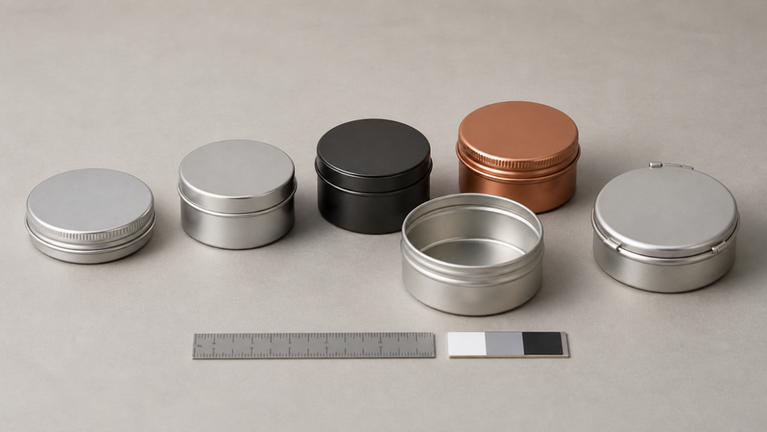
A printed tin can use opaque ink to hide the metal, transparent color to tint it, or open areas to reveal it. The material can become a highlight, background, border, or texture. Metallic show-through is especially effective when it contrasts with matte areas and when the visible metal is protected by an appropriate clear finish.
Avoid treating “gold,” “silver,” or “metallic” as a complete specification. Provide a physical reference, identify the viewing light, and approve a formed sample. The custom printed tins artwork guide [Internal Link] covers color and file preparation in more detail.
Check Durability and Production Consistency
A premium effect that scratches easily or varies visibly can reduce perceived quality. Packaging teams should discuss the complete forming and packing process with the tin manufacturing team [Internal Link], not only the flat print sample.
- Review abrasion, scuffing, fingerprints, and cleaning under the real distribution channel.
- Inspect finish around seams, curls, hinges, windows, beads, and formed corners.
- Set a color and gloss reference plus acceptable variation.
- Confirm whether protective films or separators are needed during packing.
- Evaluate the final pack under retail lighting and photography lighting.
- Keep one approved sample as the production standard.
Frequently Asked Questions
Is matte or gloss better for tin packaging?
Neither is universally better. Matte can feel restrained and contemporary; gloss can intensify color and energy. Choose according to brand signal, artwork, handling, photography, and scuff tolerance.
Can embossing be combined with printing?
Yes, subject to structure, tooling, artwork, and registration tolerance. Use robust shapes and approve a formed sample.
How many finishes should one tin use?
Use the fewest effects needed to create clear hierarchy. One dominant finish plus one tactile or metallic accent is often stronger than several competing processes.
Conclusion
Tin packaging finishes create value when they express the brand, survive the supply chain, and remain consistent across production. Start with message hierarchy, choose a dominant finish, add one purposeful accent, and approve the result on a formed sample.
To compare finish samples and structure options for custom tins [Internal Link], contact ShingWah Tins [Internal Link] with the artwork, quantity, shape, target appearance, and launch date.
Technical note: Product-contact, barrier, shelf-life, child-resistance, recyclability, regulatory, and performance claims must be verified for the exact packaging system and target market.


3 Comments
Comments are closed.