

Custom Printed Tins: Design Artwork That Survives Forming and Wins on Shelf
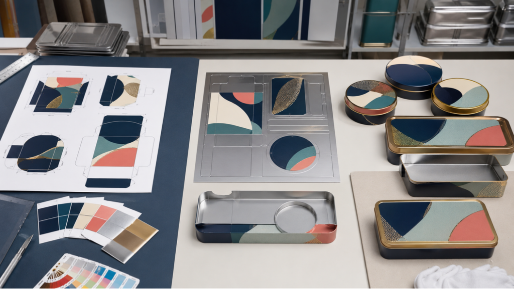
Custom printed tins begin as flat artwork but end as formed three-dimensional objects. Panels are cut, rolled, stamped, curled, seamed, and assembled, which means graphics near corners, beads, hinges, and lid edges may stretch or disappear. A design that ignores the structure can lose legibility even when the print itself is accurate.
This guide helps brand and packaging teams prepare stronger artwork for custom printed tin cans. It focuses on hierarchy, dielines, color, metallic effects, proofing, and production tolerances so the final pack looks intentional on shelf and remains practical to manufacture.
Design the Information Hierarchy First
Decide what a customer must recognize from shelf distance: brand, product, variant, and one primary benefit or visual cue. Secondary copy, instructions, legal information, and barcodes should have defined panels rather than compete with the front-facing message.
Choose the display orientation before assigning panels. Round tins may rotate, so key information may need to repeat or wrap. Square and rectangular tins provide clearer fronts but require corner-safe artwork. The lid is often the strongest visual field and should carry the main message.
Use the Final Dieline and Respect Forming Zones
Do not build production artwork on a guessed rectangle. Use the supplier’s final dieline after the structure is approved. Mark bleed, safe zones, trim, seams, curls, hinges, windows, emboss areas, and any panel that will stretch during forming.
Keep critical text, thin rules, faces, and barcode elements away from high-distortion zones. Let background color or forgiving patterns cross seams and curls. Confirm the viewing direction of every component before release.
- Outline or package fonts according to the supplier’s file requirements.
- Supply linked images at the required effective resolution.
- Name spot colors and finish layers clearly.
- Separate emboss, white ink, varnish, and metallic areas into controlled layers.
- Include a low-resolution reference PDF showing the intended appearance.
Plan Color for Printed Metal
Screen color is not a production standard. Metal, white base layers, transparent inks, varnish, and lighting all change perception. Approve a relevant color proof and a formed sample for critical launches.
| Color approach | Strength | Control point |
| Opaque CMYK / spot color | Predictable brand fields and illustrations | Approve proof method and white base strategy |
| Metallic show-through | Uses the substrate for shine and depth | Define open or transparent areas precisely |
| Limited spot palette | Strong consistency and simple hierarchy | Provide physical color references where critical |
| Photographic artwork | Rich product and lifestyle storytelling | Check tonal range, forming distortion, and small detail |
Use Finishes to Reinforce, Not Rescue, the Design
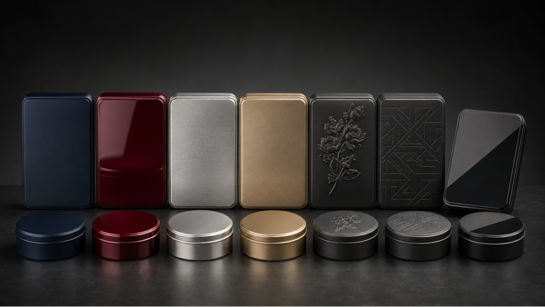
Matte or gloss varnish, metallic areas, embossing, and debossing can add hierarchy and touch. They cannot fix crowded copy, weak contrast, or an unclear product name. Add effects only after the flat design reads correctly.
The tin packaging finishes guide [Internal Link] explains process trade-offs. When embossing is used, allow registration tolerance between the printed graphic and raised feature. Avoid thin printed outlines that make small variation obvious.
Approve the Formed Sample and Production Standard
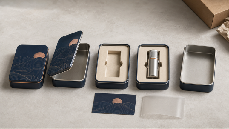
A flat proof validates content and general color direction; a formed sample validates how the artwork behaves on the real structure. Review seam alignment, corner distortion, lid-to-base orientation, barcode scan, emboss registration, gloss, color, and the visual effect of the filled product.
Keep one signed reference sample or documented standard for mass-production inspection. The tin box manufacturing process [Internal Link] shows where artwork approval connects to printing, cutting, forming, assembly, and packing.
- Check the sample under retail, office, and photography lighting.
- Photograph all sides and record approved color and finish references.
- Define acceptable variation for registration, scratches, dents, and gloss.
- Verify carton separators or protective films do not mark the surface.
Frequently Asked Questions
Can a tin be printed edge to edge?
Large areas can be decorated, but seams, curls, hinges, forming zones, and component boundaries require bleed and safe-area planning. Use the final supplier dieline.
Should designers use CMYK or Pantone colors?
The right choice depends on artwork, brand-color sensitivity, print process, and cost. Spot colors may support consistency; CMYK suits images and multi-color art. Confirm proofing and substrate effects.
Why does artwork look different after forming?
Metal stretches, curves, folds, and joins during production. Graphics near radii, seams, beads, and deep draws can distort, which is why placement and formed-sample approval matter.
Conclusion
Production-ready tin artwork starts with the final structure and a disciplined information hierarchy. Respect forming zones, control color and metallic layers, use finishes selectively, and approve the design on a formed sample.
For dielines, mockups, and print guidance, contact ShingWah Tins [Internal Link] with the selected tin, artwork files, quantity, finish plan, and launch date.
Technical note: Product-contact, barrier, shelf-life, child-resistance, recyclability, regulatory, and performance claims must be verified for the exact packaging system and target market.

6 Comments
Comments are closed.